niels segers

Publishing custom shadcn/ui components

cover

Sep 6, 2024

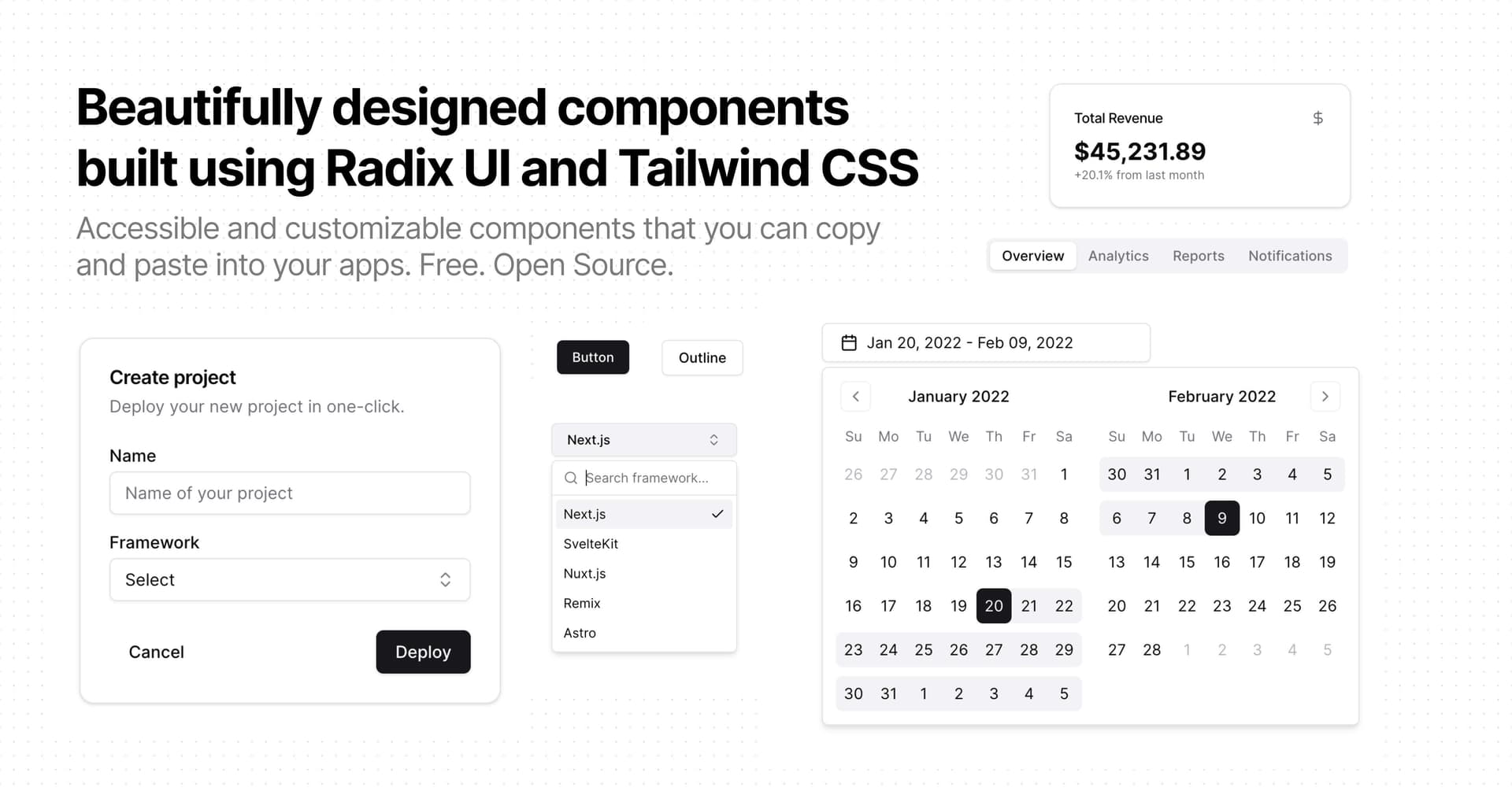
With the August 2024 update of the shadcn/ui CLI tool, developers can now add support for custom components. This opens up exciting possibilities for creating and sharing your own component libraries. In this post, we'll walk through the process of setting up your own shadcn/ui registry.

1. Set Up Your Project Structure

First, let's create a directory structure for our custom registry:

my-registry/
├── src/
│   └── components/
│       └── ui/
│           └── component.tsx
├── scripts/
│   └── registry.ts
└── public/

2. Create Your Custom Component

Let's say we want to add a custom component to our registry. Create a file src/components/ui/component.tsx and write your component code.

3. Create the Registry Build Script

Now, let's create a script to generate the registry JSON files. Create a file scripts/build.ts and configure your components:

1 2 3 4 5 6 7 8 9 10 11 12 13 14 15 16 17 18 19 20 21 22 23 24 25 26 27 28 29 30 31 32 33 34 35 36 37 38 39 40 41 42 43 44 45 46 47 48 49 50 51 52 53 54 55 56 57 58 59 60 61 62 63 64 65 66 67 68 69 70 71 72 73 74 75 76 77 78 79 80 81 82 83 84 85 86 87 88 89 90 91 92 93 94 95 import fs from "fs"; import path from "path"; export interface Schema { name: string; type: "registry:ui"; registryDependencies: string[]; dependencies: string[]; devDependencies: string[]; tailwind: { config?: Record<string, object>; }; cssVars: { light: Record<string, string>; dark: Record<string, string>; }; files: Array<{ path: string; content: string; type: "registry:ui"; }>; } type ComponentDefinition = Partial< Pick< Schema, | "dependencies" | "devDependencies" | "registryDependencies" | "cssVars" | "tailwind" > > & { name: string; path: string; }; // Define the components and their dependencies that should be registered const components: ComponentDefinition[] = [ { name: "component", path: path.join(__dirname, "../src/components/ui/component.tsx"), registryDependencies: ["button", "input"], dependencies: ["lucide-react"], cssVars: { light: {}, dark: {}, }, tailwind: { config: { theme: { extend: { colors: {}, }, }, }, }, }, ]; // Create the registry directory if it doesn't exist const registry = path.join(__dirname, "../public"); if (!fs.existsSync(registry)) { fs.mkdirSync(registry); } // Create the registry files for (const component of components) { const content = fs.readFileSync(component.path, "utf8"); const schema = { name: component.name, type: "registry:ui", registryDependencies: component.registryDependencies || [], dependencies: component.dependencies || [], devDependencies: component.devDependencies || [], tailwind: component.tailwind || {}, cssVars: component.cssVars || { light: {}, dark: {}, }, files: [ { path: `${component.name}.tsx`, content, type: "registry:ui", }, ], } satisfies Schema; fs.writeFileSync( path.join(registry, `${component.name}.json`), JSON.stringify(schema, null, 2) ); }

This script reads your component files, creates a schema for each component, and generates JSON files in the public directory.

4. Add a Build Script

Add a script to your package.json to run the registry generation:

1 2 "scripts": { "build:registry": "npx bun ./scripts/build.ts",

5. Generate the Registry

Run the build script to generate your registry:

1 npm run build:registry

This will create a JSON file for each component in the public directory.

6. Use Your Custom Registry

Now you can use your custom registry with the shadcn/ui CLI. When adding a component, specify the URL to your registry like so:

1 npx shadcn add "https://registry.niels.foo/chat.json"

This will fetch the chat.json schema from your registry and add the Chat component to your project. More info about this specific component can be found here.

Conclusion

Creating your own shadcn/ui registry allows you to share custom components across projects or with the community. By following these steps, you can set up a registry for your own component library, making it easy to reuse and distribute your UI components.